Matplotlib is the most commonly used visualization library in Python. It provides a series of plotting functions that can easily create various types of charts. Libraries such as Proplot, Plotly, and Cartopy are extensions built on top of Matplotlib.
Therefore, today we will introduce Python visualization starting from the fundamental structure of Matplotlib, and later extend this knowledge to higher-level visualization modules and third-party libraries.
Creating the First Figure
First, let’s create a most basic figure using the Matplotlib library.
We need the matplotlib.pyplot module, which provides a series of functions for creating various figures.
python
import matplotlib.pyplot as plt
import numpy as np
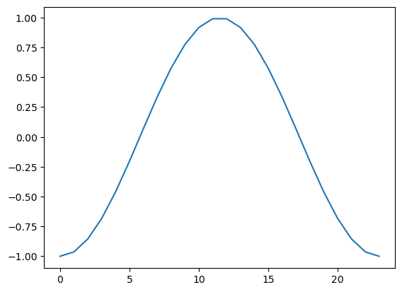
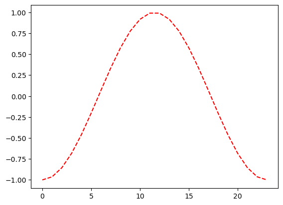
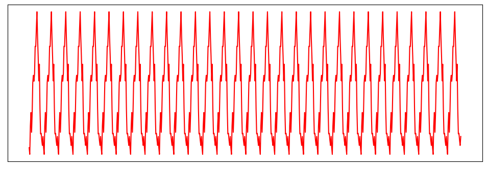
We assume the diurnal temperature variation at a location follows a sine wave and create the temperature curve with hourly steps.
python
temp = np.sin(np.linspace(-1/2*np.pi, 3/2*np.pi, 24))
temp
# Output example:
# array([-1.        , -0.96291729, -0.8544194 , -0.68255314, -0.46006504,
#        -0.20345601,  0.06824241,  0.33487961,  0.57668032,  0.77571129,
#         0.9172113 ,  0.99068595,  0.99068595,  0.9172113 ,  0.77571129,
#         0.57668032,  0.33487961,  0.06824241, -0.20345601, -0.46006504,
#        -0.68255314, -0.8544194 , -0.96291729, -1.        ])
Then, by specifying x and y data, we can use the plot() function to draw the variation curve.
python
plt.plot(range(24), temp)
At this point, the figure’s size and aspect ratio are automatically adjusted by Python. We can create a figure and specify its size using the figsize parameter for customization.
python
plt.figure(figsize=(10, 6))         # Create a figure and specify width and height.
plt.plot(range(24), temp + np.random.rand(24))
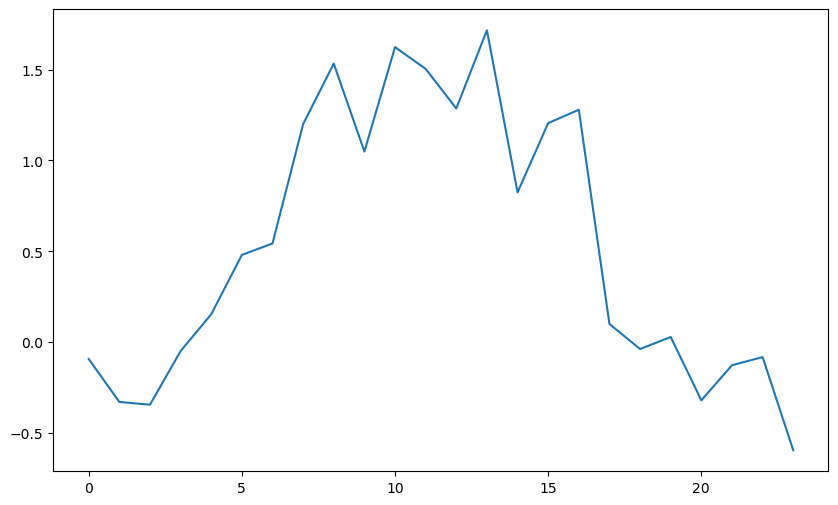
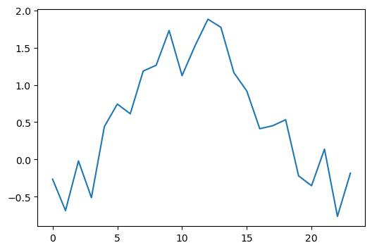
It’s worth noting that if we don’t create a new figure, plotting will continue on the current figure.
python
plt.plot(range(24), temp + np.random.rand(24))
plt.plot(range(24), temp + np.random.rand(24))
plt.plot(range(24), temp + np.random.rand(24))
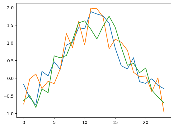
Below, let’s see examples of creating a new figure for each plot.
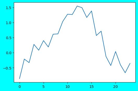
Simultaneously, we can also set parameters like facecolor and dpi for the figure.
python
plt.figure(figsize=(6, 4))
plt.plot(range(24), temp + np.random.rand(24))
plt.figure(figsize=(6, 4), facecolor='cyan')            # Set figure background color to cyan.
plt.plot(range(24), temp + np.random.rand(24))
plt.figure(figsize=(6, 4), dpi=400)                    # Set figure resolution to 400 DPI.
plt.plot(range(24), temp + np.random.rand(24))
Adjusting Figure Symbols
After creating a figure, we can further set figure symbols, such as lines, colors, transparency, etc., to achieve richer visualization effects.
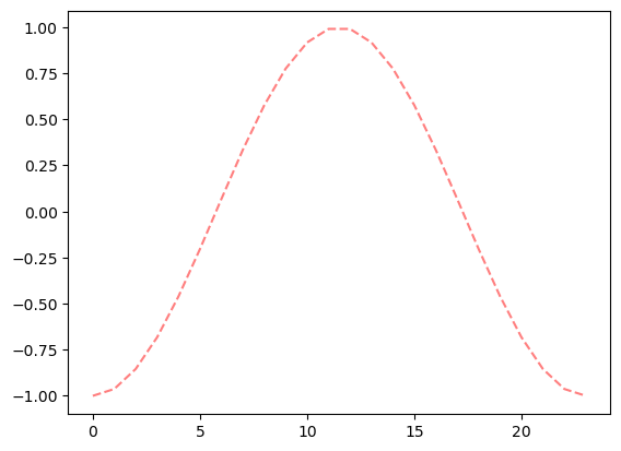
First, let’s try changing the sine curve to a red dashed line. Achieved by setting the parameters linestyle and color respectively, which can be equivalently abbreviated as ls and c. Subsequent usage may mix them and will not be elaborated further.
python
plt.plot(range(24), temp, c='r', linestyle='--')
Further set the alpha parameter to adjust transparency.
python
plt.plot(range(24), temp, c='r', linestyle='--', alpha=0.5)
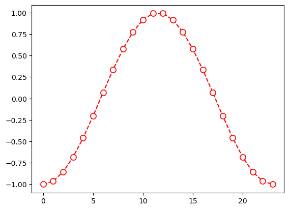
Sometimes we need to highlight data points within the data. We can achieve this by setting the marker property.
Main properties include:
marker: Sets the shape of data points, like dot, circle, square, triangle, star, etc.markersize: Sets the size of data points.markeredgewidth: Sets the border width of data points.markerfacecolor: Sets the fill color of data points.markeredgecolor: Sets the border color of data points.
python
plt.plot(range(24), temp, c='r', linestyle='--', marker='o', markersize=8, markerfacecolor='white', markeredgecolor='r')
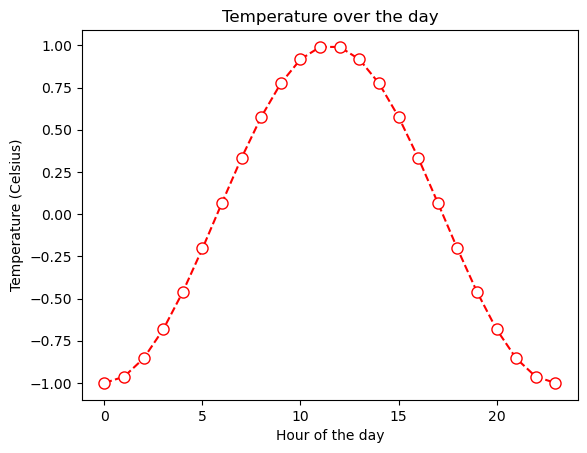
We can further specify axis labels and title for the chart.
python
plt.plot(range(24), temp, c='r', linestyle='--', marker='o', markersize=8, markerfacecolor='white', markeredgecolor='r')
plt.xlabel('Hour of the day')
plt.ylabel('Temperature (Celsius)')
plt.title('Temperature over the day')
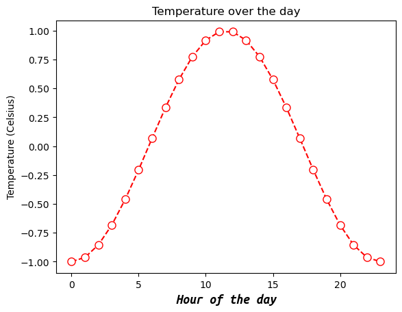
Sometimes the default font type, size, and style of the plot are unsatisfactory. We can also customize them using a series of parameters:
fontname: Font name.fontsize: Font size in points (pt).fontstyle: Font style, can benormal,italic,oblique.fontweight: Font weight, can belight,normal,regular,bold, etc.
python
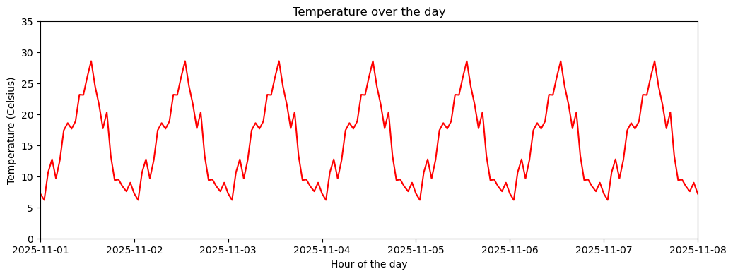
plt.plot(range(24), temp, c='r', linestyle='--', marker='o', markersize=8, markerfacecolor='white', markeredgecolor='r')
plt.xlabel('Hour of the day', fontname='Ubuntu Mono', fontsize='14', fontweight='bold', fontstyle='italic')
plt.ylabel('Temperature (Celsius)')
plt.title('Temperature over the day')
However, customizing fonts at every text location often becomes cumbersome. We can modify the global font settings so that all basic font parameters for the current plotting code are changed.
Below, we modify the global default font type and size by setting font.size and font.family in rcParams.
python
plt.rcParams['font.size'] = 12
plt.rcParams['font.family'] = 'Ubuntu Mono'

plt.plot(range(24), temp, c='r', linestyle='--', marker='o', markersize=8, markerfacecolor='white', markeredgecolor='r')
plt.xlabel('Hour of the day')
plt.ylabel('Temperature (Celsius)')
plt.title('Temperature over the day')
plt.show()
Axes and Labels
Beyond the figure itself, properly displaying axes is also an important step in visualization.
The 24-hour temperature variation might make this feature hard to see. Let’s create monthly temperature data on an hourly scale as a case study.
python
import pandas as pd

temp0 = temp.copy()
temp = temp0 + np.random.rand(24) # Add some randomness.

df = pd.DataFrame({'Time': pd.date_range('2025-11-01', periods=30*24, freq='1h'), # 30 days * 24 hours.
                   'Beijing': (temp * 10).tolist() * 30, # Scale and repeat for 30 days.
                   'Shenzhen': (temp * 10 + 10).tolist() * 30}) # Shift and repeat for 30 days.

df.set_index('Time', inplace=True)
df.head()
# Output (example):
#                     Beijing  Shenzhen
# Time
# 2025-11-01 00:00:00 -2.787003  7.212997
# 2025-11-01 01:00:00 -3.827549  6.172451
# 2025-11-01 02:00:00  0.636398 10.636398
# 2025-11-01 03:00:00  2.737090 12.737090
# 2025-11-01 04:00:00 -0.366644  9.633356
Labels
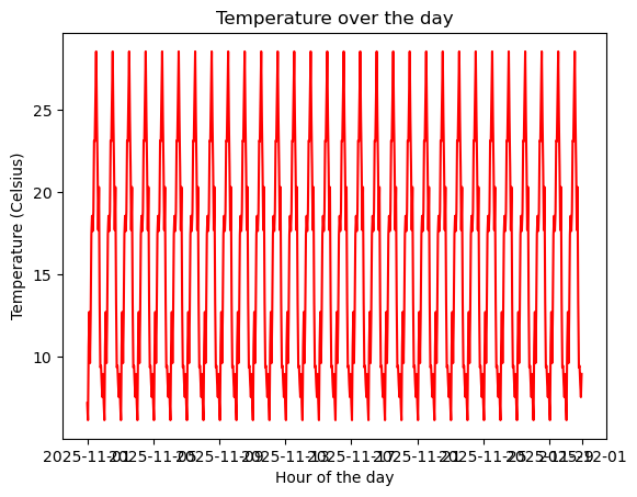
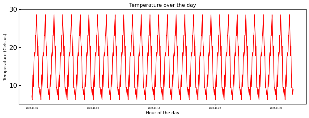
Since the time series involves dates, displaying them too densely can cause them to clump together.
A typical situation is shown in the following figure:
python
plt.plot(df['Shenzhen'], c='r')
plt.xlabel('Hour of the day')
plt.ylabel('Temperature (Celsius)')
plt.title('Temperature over the day')
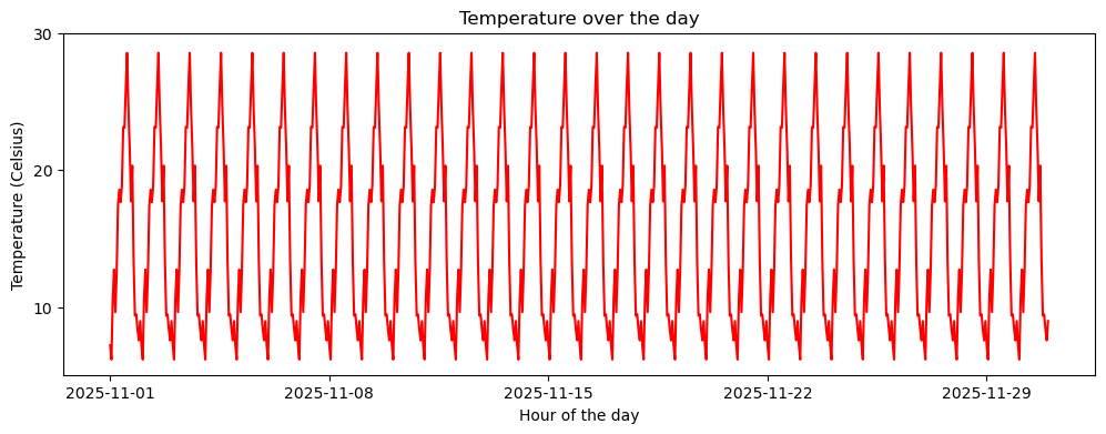
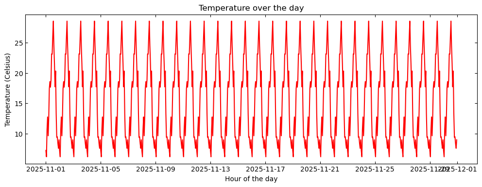
One possible solution is to lengthen the figure.
python
plt.figure(figsize=(12, 4))
plt.plot(df['Shenzhen'], c='r')
plt.xlabel('Hour of the day')
plt.ylabel('Temperature (Celsius)')
plt.title('Temperature over the day')

This seems better, but the last two dates overlap.
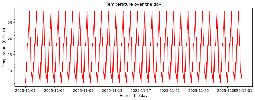
A better solution is to customize the axis tick positions and tick labels.
Major Ticks
Python allows separate adjustments for major and minor ticks. Here, we first introduce major ticks.
First, we can use the xticks() and yticks() functions to set the display positions of major ticks.
python
plt.figure(figsize=(12, 4))
plt.plot(df['Shenzhen'], c='r')
plt.xlabel('Hour of the day')
plt.ylabel('Temperature (Celsius)')
plt.title('Temperature over the day')
plt.xticks(['2025-11-01', '2025-11-08', '2025-11-15', '2025-11-22', '2025-11-29'])
plt.yticks([10, 20, 30])
Of course, it’s not just about specifying tick positions. We can pass another list to tell the function what content should be displayed at these tick positions.
python
plt.figure(figsize=(12, 4))
plt.plot(df['Shenzhen'], c='r')
plt.xlabel('Hour of the day')
plt.ylabel('Temperature (Celsius)')
plt.title('Temperature over the day')
plt.xticks(['2025-11-01', '2025-11-08', '2025-11-15', '2025-11-22', '2025-11-29'],
           ['Nov.1 25', 'Nov.8 25', 'Nov.15 25', 'Nov.22 25', 'Nov.29 25'])
plt.yticks([10, 20, 30], ['10°C', '20°C', '30°C'])
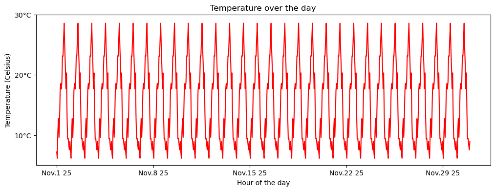
Since the positions are manually specified, the display positions don’t have to be equidistant.
python
plt.figure(figsize=(12, 4))
plt.plot(df['Shenzhen'], c='r')
plt.xlabel('Hour of the day')
plt.ylabel('Temperature (Celsius)')
plt.title('Temperature over the day')
plt.xticks(['2025-11-01', '2025-11-05', '2025-11-15', '2025-11-20', '2025-11-30'],
['Nov.1 25', 'Nov/5 25', '25 Nov.15', '25-11-20', '25/11~30'])
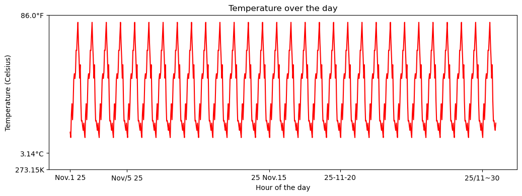
plt.yticks([0, 3.14, 30], ['273.15K', '3.14°C', f'{30 * 9/5 + 32:.1f}°F'])
If we don’t pass any content, the ticks disappear.
python
plt.figure(figsize=(12, 4))
plt.plot(df['Shenzhen'], c='r')
plt.xticks([])
plt.yticks([])
We can also use the tick_params() function to further adjust tick label size, tick line shape, etc.
python
plt.figure(figsize=(12, 4))
plt.plot(df['Shenzhen'], c='r')
plt.xlabel('Hour of the day')
plt.ylabel('Temperature (Celsius)')
plt.title('Temperature over the day')
plt.xticks(['2025-11-01', '2025-11-08', '2025-11-15', '2025-11-22', '2025-11-29'])
plt.yticks([10, 20, 30])
plt.tick_params(axis='x', which='major', labelsize=5)
plt.tick_params(axis='y', which='major', labelsize=15, direction='in', length=5, width=2)
Also, the axes on which ticks are displayed.
python
plt.figure(figsize=(12, 4))
plt.plot(df.index.values, df['Shenzhen'].values, c='r') # Use .values to avoid datetime formatting issues in some cases.
plt.xlabel('Hour of the day')
plt.ylabel('Temperature (Celsius)')
plt.title('Temperature over the day')
plt.tick_params(axis='both', which='major', labelsize=10, direction='in', bottom=True, top=True, left=True, right=True)

Minor Ticks
Minor ticks are turned off by default and can be enabled with the minorticks_on() function.
python
plt.figure(figsize=(12, 4))
plt.plot(df.index.values, df['Shenzhen'].values, c='r')
plt.xlabel('Hour of the day')
plt.ylabel('Temperature (Celsius)')
plt.title('Temperature over the day')
plt.minorticks_on()
Similarly, they can be customized like major ticks.
python
plt.figure(figsize=(12, 4))
plt.plot(df.index.values, df['Shenzhen'].values, c='r')
plt.xlabel('Hour of the day')
plt.ylabel('Temperature (Celsius)')
plt.title('Temperature over the day')
plt.minorticks_on()
plt.tick_params(which='minor', length=8, width=1)
Axis Display Range
Often we don’t need to display the complete data series, or there are outliers causing the entire curve’s variation range to be very subtle.
In such cases, we may need to adjust the chart’s display range to achieve the desired visualization effect.
python
plt.figure(figsize=(12, 4))
plt.plot(df['Shenzhen'], c='r')
plt.xlabel('Hour of the day')
plt.ylabel('Temperature (Celsius)')
plt.title('Temperature over the day')
plt.xlim(df.index[0], df.index[7 * 24])         # Display the first 7 days of hourly temperature.
plt.ylim(0, 35)                                 # Adjust temperature display range to 0-35°C.
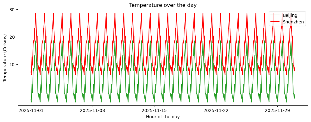
Legend
As an important component of a chart, the legend is indispensable in plotting.
In Matplotlib, we simply need to specify the label parameter during plotting, and then use the legend() function to create the legend.
python
plt.figure(figsize=(12, 4))
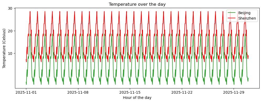
plt.plot(df['Beijing'], c='tab:green', label='Beijing')
plt.plot(df['Shenzhen'], c='r', label='Shenzhen')
plt.xlabel('Hour of the day')
plt.ylabel('Temperature (Celsius)')
plt.title('Temperature over the day')
plt.xticks(['2025-11-01', '2025-11-08', '2025-11-15', '2025-11-22', '2025-11-29'])
plt.yticks([10, 20, 30])
plt.legend()
By further specifying parameters, we can adjust the legend style. Common parameters include:
loc: Legend location. Can be'best','upper right','upper left','lower left','lower right','right','center left','center right','lower center','upper center','center'.ncol: Number of columns for the legend.fontsize: Font size.frameon: Whether to display the border (TrueorFalse).
python
plt.figure(figsize=(12, 4))
plt.plot(df['Beijing'], c='tab:green', label='Beijing')
plt.plot(df['Shenzhen'], c='r', label='Shenzhen')
plt.xlabel('Hour of the day')
plt.ylabel('Temperature (Celsius)')
plt.title('Temperature over the day')
plt.xticks(['2025-11-01', '2025-11-08', '2025-11-15', '2025-11-22', '2025-11-29'])
plt.yticks([0, 10, 20, 30])
plt.legend(loc='upper right', ncol=2, frameon=False)
Grid and Frame
Adding a grid to a figure is a common plotting method, allowing for more detailed observation of data distribution.
Matplotlib provides the grid() function to easily add a grid.
python
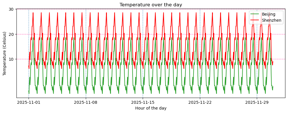
plt.figure(figsize=(12, 4))
plt.plot(df['Beijing'], c='tab:green', label='Beijing')
plt.plot(df['Shenzhen'], c='r', label='Shenzhen')
plt.xlabel('Hour of the day')
plt.ylabel('Temperature (Celsius)')
plt.title('Temperature over the day')
plt.xticks(['2025-11-01', '2025-11-08', '2025-11-15', '2025-11-22', '2025-11-29'])
plt.yticks([10, 20, 30])
plt.legend()
plt.grid(True)

We can also separately set grid line styles for different axes. If we need to set grid styles for all axes simultaneously, just remove the axis parameter.
python
plt.figure(figsize=(12, 4))
plt.plot(df['Beijing'], c='tab:green', label='Beijing')
plt.plot(df['Shenzhen'], c='r', label='Shenzhen')
plt.xlabel('Hour of the day')
plt.ylabel('Temperature (Celsius)')
plt.title('Temperature over the day')
plt.xticks(['2025-11-01', '2025-11-08', '2025-11-15', '2025-11-22', '2025-11-29'])
plt.yticks([10, 20, 30])
plt.legend()
plt.grid(True, linestyle='--', alpha=0.7, which='major', c='tab:blue', axis='x')
plt.grid(True, linestyle='--', alpha=0.7, which='major', c='deeppink', axis='y')
Based on our experience learning coordinate systems in middle school, complete top, bottom, left, and right axes aren’t always necessary; we can choose to turn off some of them.
python
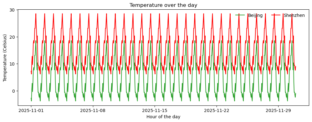
plt.figure(figsize=(12, 4))
plt.plot(df['Beijing'], c='tab:green', label='Beijing')
plt.plot(df['Shenzhen'], c='r', label='Shenzhen')
plt.xlabel('Hour of the day')
plt.ylabel('Temperature (Celsius)')
plt.title('Temperature over the day')
plt.xticks(['2025-11-01', '2025-11-08', '2025-11-15', '2025-11-22', '2025-11-29'])
plt.yticks([10, 20, 30])
plt.ylim(-5, 30)
plt.legend()
plt.gca().spines['top'].set_visible(False)
plt.gca().spines['right'].set_visible(False)
Here, the gca() function is used to get the current axes, the spines attribute is used to get the axes’ spines (borders), and the set_visible method is used to set the visibility of the spine.
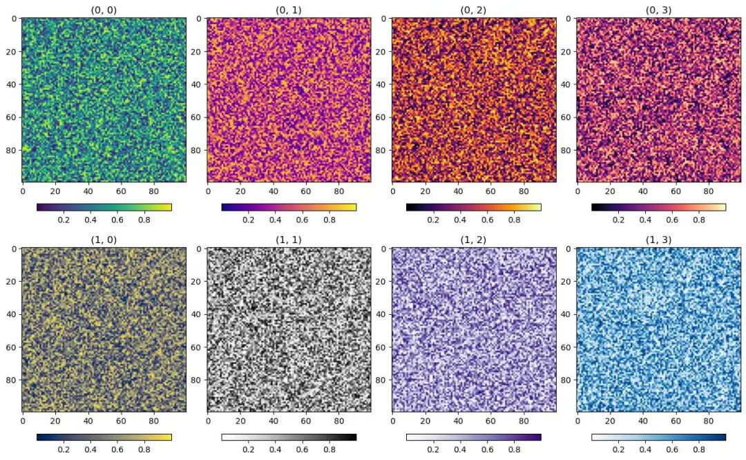
Subplots
Finally, let’s briefly introduce subplots. This is just a demonstration; more detailed content will follow in later columns.
Often, we need to place multiple plots on the same canvas, which requires subplots. We can use the subplots() function to create subplots and specify the number of rows and columns.
python
fig, axes = plt.subplots(2, 4, figsize=(16, 10))            # Create a 2x4 grid of subplots, set figure size to (16, 10)

fig.subplots_adjust(wspace=0.1, hspace=0.05) # Adjust horizontal and vertical spacing between subplots.

# Create two lists storing functions for different colormaps.
cmaps = [[plt.cm.viridis, plt.cm.plasma, plt.cm.inferno, plt.cm.magma],
         [plt.cm.cividis, plt.cm.Greys, plt.cm.Purples, plt.cm.Blues]]

# Iteratively draw subplots, set titles and colormaps.
for i in range(2):
    for j in range(4):
        ax = axes[i, j]
        # The imshow() function is used to plot a 2D array.
        h = ax.imshow(np.random.rand(100, 100), cmap=cmaps[i][j])
        ax.set_title(f"({i}, {j})")
        fig.colorbar(h, ax=ax, orientation="horizontal", shrink=0.8, pad=0.1)
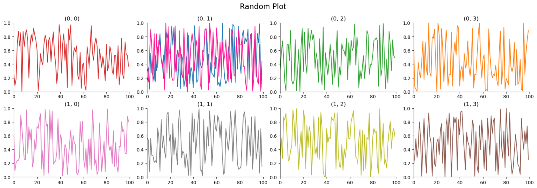
plt vs ax
Note here that, compared to using functions called from the plt module for setting various figure symbols and elements previously, here we are using methods based on the ax object to set figure symbols and elements.
The difference is that plt only acts on the last figure area, while ax objects can act on different figure areas by specifying different figure area names.
As in the following example, we can specify the figure region represented by ax to modify a specific plot.
python
fig, axes = plt.subplots(2, 4, figsize=(20, 6))

fig.subplots_adjust(wspace=0.15, hspace=0.25)

cs = [['tab:red', 'tab:blue', 'tab:green', 'tab:orange', 'tab:purple'],
      ['tab:pink', 'tab:gray', 'tab:olive', 'tab:brown', 'tab:cyan']]

for i in range(2):
    for j in range(4):
        ax = axes[i, j]
        h = ax.plot(np.random.rand(100), c=cs[i][j])
        ax.set_title(f"({i}, {j})")
        ax.spines['top'].set_visible(False)
        ax.spines['right'].set_visible(False)
        ax.set_ylim(0, 1)
        ax.set_xlim(0, 100)

# Add another curve to the plot at row 0, column 1.
ax = axes[0, 1]
ax.plot(np.random.rand(100), c='deeppink')

# Can set a main title for all subplots.
plt.suptitle("Random Plot", fontsize=16)
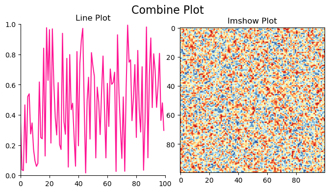
Saving Figures
Finally, there’s the issue of saving the plotted figure. You can use the savefig() function to save the figure as a specific format file.
Simultaneously, some parameters can be set, such as:
format: Sets the image format. Default ispng.dpi: Sets the image resolution. Default is100.transparent: Sets whether the background is transparent. Default isFalse.
python
fig, axes = plt.subplots(1, 2, figsize=(8, 4))

fig.subplots_adjust(wspace=0.1, hspace=0.1)

ax = axes[0]
h = ax.plot(np.random.rand(100), c='deeppink')
ax.set_title(f"Line Plot")
ax.spines['top'].set_visible(False)
ax.spines['right'].set_visible(False)
ax.set_ylim(0, 1)
ax.set_xlim(0, 100)

ax = axes[1]
h = ax.imshow(np.random.rand(100, 100), cmap='RdYlBu_r')
ax.set_title(f"Imshow Plot")

plt.suptitle("Combine Plot", fontsize=16)
plt.savefig("CombinePlot.png", dpi=400, transparent=True)
Postscript
The above is my understanding of the basic framework of Python visualization. Subsequently, we can conduct different types of visualization exploration based on this framework.
The functions I listed include only some parameters I commonly use. Many parameters haven’t been mentioned; if needed, please explore them on your own.