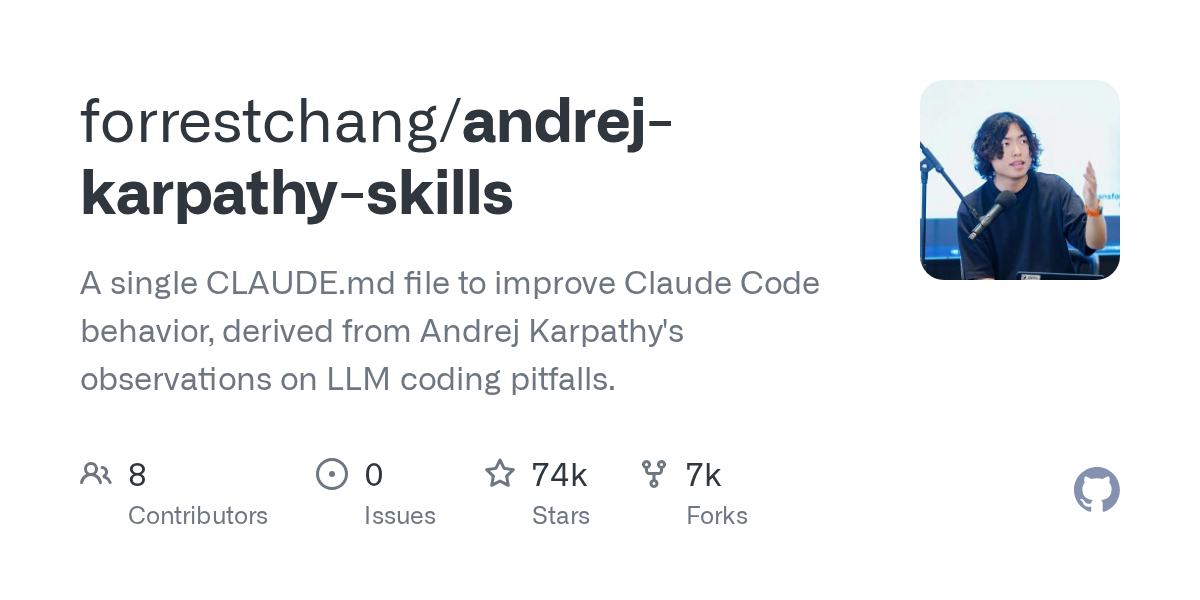
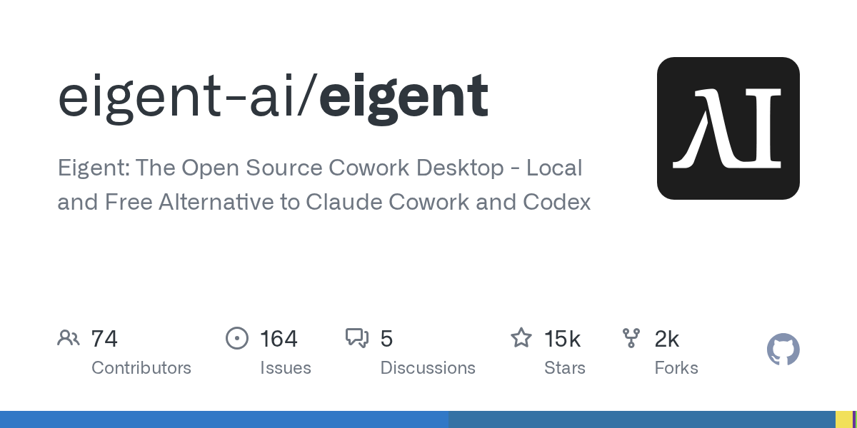
your repository in a chat and it renders as a grey rectangle with your avatar in the corner.
The project is good. It solves a real problem, the code is clean, the tests pass, and somebody spent months on it. None of that reaches the person seeing the link, because what reaches them is a default card nobody configured and a README that opens with a heading and a paragraph of prose.
Meanwhile a considerably weaker project with a logo, a banner and a screenshot at the top gets the attention, and the reason is not that people are shallow. It is that presentation is the only signal available before somebody reads the code, and almost nobody reads the code.
Maintainers are engineers. The visual layer is the part that never gets done, and an AI Image Generator creating visual assets through Higgsfield has made it a solved problem rather than a permanent backlog item.
Why does a good project look abandoned?
Because the signals people use to judge maintenance status are mostly cosmetic.
A visitor arriving at a repository makes a decision in seconds, and the inputs are last commit date, star count, open issue count, and how the README looks. Only the first of those says anything about whether the project is maintained.
A bare README reads as neglect even on a project committed to this morning. No banner, no logo, no screenshot, no badges, just a heading and some prose. Compare it against a project with a hero image and the same code quality, and the second one looks alive.
The effect compounds. Fewer visitors means fewer stars, fewer stars means lower placement in search and directory listings, and lower placement means fewer visitors.
None of this is a judgement about engineering. It is what happens when the only available proxy for effort is the part of the project engineers are least interested in.
What does a shared link actually render?
Usually a default, because almost nobody sets the image.
Repository hosts support a social preview image, an asset set in the repository settings that appears when the link is shared anywhere that unfurls URLs. Chat platforms, forums, social posts, aggregators, link previews in issue trackers.
The recommended shape is roughly twice as wide as it is tall, and the file is set once in settings rather than committed to the repository.
Most projects never set it, so the platform falls back to the owner’s avatar on a plain background, which communicates nothing and looks identical to every other unset repository.
That card is frequently the only impression a project makes. A link posted in a busy channel gets a glance, and the card is what gets glanced at.
Setting it takes two minutes once the image exists, which is the entire problem. The image does not exist because making one required design skill nobody on the project has.
Which visual assets does a repository need?
Fewer than it sounds, and they are reusable.
A logo or mark, which serves the README, the documentation site favicon, the social card and any package registry listing that displays one.
A social preview card, in the wide format described above, carrying the name and ideally a one-line description of what the thing does.
A README banner, which is the first thing a visitor sees and does more than any other single asset.
Screenshots, for anything with an interface, which is covered separately below because the rules differ.
An architecture or flow diagram, for anything whose value is hard to convey in prose, which for infrastructure and backend tooling is most of them.
And release graphics, if the project announces versions anywhere public.
Six assets, produced once, with the last two needing occasional updates. That is a bounded task rather than an ongoing design commitment.
How much does presentation affect adoption?
More than engineers expect and less than designers claim.
It does not make a bad project succeed. Nothing about a banner fixes an API that is painful to use or documentation that assumes knowledge the reader lacks.
What it does is remove a filter. People evaluating three options for the same job will look properly at the one that appears maintained, and appearing maintained is largely visual at the first glance.
Contributors respond to it particularly strongly. Somebody deciding where to spend unpaid evenings is assessing whether a project is alive, whether the maintainer cares, and whether their work will be merged. Presentation signals all three, accurately or otherwise.
Directory and awesome-list placement frequently displays a logo or a card, and entries with images are simply seen more.
And it affects how the project is described by others. A project with a clear mark and a consistent look gets referred to by name and recognised later. One without gets described as that thing somebody mentioned.
What can an AI Image Generator produce for a project?
The whole set, in one sitting, which is the change worth understanding.
A logo or mark developed in an AI Image Generator from a description of what the project does and what it should feel like, with several directions to choose between rather than one to accept.
The social preview card from the same AI Image Generator session, at the correct proportions, with the project name legible at the small size a link preview actually renders.
A README banner, which an AI Image Generator produces as the same visual identity in a different shape rather than a separate design exercise.
Background and texture material from an AI Image Generator for a documentation site, where most projects end up with a default theme because theming requires assets nobody has.
Conceptual illustrations for documentation, explaining an architecture or a data flow, which an AI Image Generator handles well because the subject is abstract rather than a real thing that must be depicted accurately.
And release or announcement graphics, which cost nothing once the identity exists and make a version announcement look deliberate.
The practical point is consistency. Six assets produced in one session from one visual direction look like a project. Six produced over two years by different people look like a history.
What must always be a real screenshot?
Anything showing the software. This is the clearest line in the article and it matters more here than in most contexts.
Never generate an interface. A screenshot in a README is a claim about what the software does and what using it looks like. A generated interface showing features that do not exist, or a layout the application does not have, is straightforwardly misleading regardless of intent.
Never generate terminal output. Same principle and easier to get wrong, since plausible-looking output is easy to produce and impossible for a reader to distinguish from real output.
Never generate a chart of results. Benchmarks, performance comparisons and usage figures are claims, and they need to come from a run somebody can reproduce.
Screenshots can be improved rather than fabricated. Cropping to the relevant area, consistent window sizing, a clean environment with sensible demo data, and a consistent theme across a set are all presentation work on genuine captures.
And demo data deserves thought. A screenshot full of placeholder text tells a reader less than one showing the tool doing something recognisable, and setting up plausible demo content is the single most underrated thing a maintainer can do for a README.
How do licensing terms apply to a generated logo?
Worth understanding before the mark ends up on everything, because open-source projects have an unusual downstream.
A project logo travels further than most images. It ends up in package registries, documentation, conference slides, third-party articles, merchandise occasionally, and sometimes in a trademark filing if the project becomes a foundation or a company.
So the terms under which an image was produced matter. Check what the service permits for commercial use and redistribution, and check it before adopting the mark rather than after two years of use.
Higgsfield publishes its terms per plan, and operates as an AI creative suite, which for a maintainer mostly means the identity work and the exports happen in one place rather than requiring separate tools. Whichever service is used, reading the terms is the step to not skip.
Distinctiveness is the other consideration. A mark that closely resembles an existing project is a problem independent of how it was produced, so it is worth searching before committing.
And document what you used, in the repository, alongside the assets. A future maintainer inheriting the project will want to know how the identity was made and whether it can be extended.
What does this look like across several projects?
Different, and worth planning for if you maintain more than one.
A maintainer with four repositories usually has four unrelated looks, or more commonly no look at all on three of them and something half-finished on the fourth. Each was approached separately, whenever there was time, with whatever felt right that week.
Treating them as a family changes the return. Shared palette, shared type treatment, marks that differ while clearly belonging together. Somebody who finds one project then recognises the others, which is how small maintainers build a reputation rather than a scattering of unconnected repositories.
An AI Image Generator makes that feasible because the direction is described once and applied across everything rather than reconstructed per project. The fourth mark costs a fraction of the first.
Higgsfield keeping the projects organised separately under one treatment is what allows a maintainer to come back a year later, add a fifth repository, and have it match without remembering anything.
The same applies to an organisation account, where a set of related tools under one banner benefits considerably more from visual coherence than any individual repository does.
And it extends to talks and writing. A maintainer giving a conference talk or writing a post about their own work already has the assets, in the right shapes, matching the repositories the audience will visit afterwards.
How do the assets stay in step with each other?
Producing them together rather than separately, which is mostly a sequencing decision.
Settle the AI Image Generator direction on one asset, usually the logo, and derive everything else from it. Colours, shapes, level of detail, the feel of the thing.
Higgsfield storing that direction is what makes the later assets match without anybody reconstructing the decisions. The description that produced the logo is the valuable artifact, more than the logo file itself, because everything downstream starts from it.
Produce the set in one Higgsfield session while the direction is fresh, rather than adding a banner six months later and discovering it does not match.
Keep the Higgsfield project organised alongside the repository, so the source material sits with the code, so a contributor can produce a matching asset without asking.
And document the palette as hex values in a contributing guide. This costs three lines and it is what allows somebody else to make a matching graphic for a blog post or a conference talk.
When is the right moment to do this?
Later than launch and earlier than most projects.
Not at the first commit. A project that may not survive its first month does not need an identity, and time spent there is time not spent on whether the thing works.
The useful trigger is the first external interest. Somebody files an issue who is not you, somebody shares the link, the project appears in a listing. At that point the presentation starts costing you something.
The second trigger is a significant release. A version worth announcing is worth announcing properly, and the assets produced then serve everything afterwards.
And a rescue case exists, which is a project that has been going for years, has real users, and still looks like a weekend experiment. Those benefit most, because the gap between the engineering and the presentation is widest.
Whichever trigger applies, an AI Image Generator changes the calculation because the work is now an afternoon rather than a design engagement nobody was going to commission.
What would one afternoon cover?
The full set, if the sequence is right.
Write down what the project does in one sentence, and what it should feel like. Fast, solid, careful, playful, minimal. That sentence is brief.
Produce several logo directions in an AI Image Generator, look at them small rather than large, and pick the one that still reads at favicon size.
Derive the social card and the README banner from the chosen AI Image Generator direction, keeping the name legible at the size a link preview renders.
Take proper screenshots of the actual software with sensible demo data, cropped consistently in Higgsfield.
Produce any diagrams the documentation needs in the same AI Image Generator session.
Set the social preview in the repository settings, which is the two-minute step everybody forgets after making the image.
Then commit the assets and the palette, and note in the contributing guide how a matching graphic can be made.
Conclusion
An unmaintained-looking project is frequently a well-maintained project whose author had no interest in making a banner, and the cost of that is paid in contributors who never arrived and users who picked something else.
Six assets fix it. A mark, a card, a banner, real screenshots, a diagram and something for releases. An AI Image Generator produces the set in an afternoon, and Higgsfield storing the direction means the asset somebody needs in two years still matches the one made today.
The screenshots stay real. Everything else is presentation, and presentation is the part that decides whether anybody looks at the code.